Release Notes 2026
Frequently Asked Questions!
How do I access field level help?
How do I see descriptions of codes in enquiry screens?
How do I make a user have read only access
Can I copy and delete lines in data entry screens?
Out of Office
Can I run a report to view security groups against my users?
How do I stop a user posting to prior and future periods?
Delete a payment run
Changing security access to a user
User setup requires multiple screens and is complicated!
De-allocate an AP Payment
How to stop over receipting of orders
Why has my transaction not appeared on the AP Payment run?
Download Templates
Useful information to include when raising Financials cases
Prevent users posting to specific balance classes
Hints and Tips!
General Ledger - Helpful how-to guides
General Ledger Data Entry
Journal Upload
Journal Entry, Copy and Authorise
Multi Level Authorisation
Modernisation Budget Upload
General Ledger Enquiries
GL Enquiries - Transaction Enquiries
GL Enquiries - Balance Sheet & Profit and Loss
GL Enquiries - Account Details
Trial Balance
Period and Year End Close
General Ledger Security
Accounts Payable - Helpful how-to guides
Accounts Payable Supplier File
Accounts Payable Data Entry
Log and Invoice/Credit note
Enter a logged Invoice
Enter a non order related Invoice
Order Related Invoice
Order Related Invoices with Mismatches
Order Related Invoice - Mismatch Scenarios
Mismatch Types
Invoice and Credit Note Matching
Accounts Payable Enquiries
Accounts Payable Transaction Maintenance
Accounts Payable Payment Processing
Accounts Payable Code Tables
Accounts Payable Reports
Accounts Receivable - Helpful how-to guides
Customer Maintenance
Enquiries
Cash Allocation
Data Entry & Contracts
Student Sponsor - Education sector
Credit Control
Credit Control Overview
Customer Statements
Diary Notes
Query Management
Interest Charges
Dunning Process
Credit Control Diary
Reporting within Financials
Student Sponsor - Education Sector
Purchasing Management - Helpful how-to guides
Fixed Assets - Helpful how-to guides
Prompt File - Asset Creation
Join Prompt File Items
Fixed Assets Period End & Depreciation
Revaluation
Disposals
Relife
Reconciliation process - Helpful how-to guides
Accounts Receivable Reconciliation Reporting
Accounts Payable Reconciliation Reporting
Daily Checks
Fixed Assets Reconciliation Reporting
General Ledger Reconciliation Reporting
Purchasing Management Reconciliation Reporting
Reporting
General Ledger Reports
Accounts Payable Reports
Accounts Receivable Reports
Sales Invoicing Reports
Fixed Assets Reports
Bank Reconciliation Reports
Import Tool Kit
Procurement Portal
Procurement Portal new User Interface
Navigation
Requisitions
Orders
Authorisation
Receiver
Invoice Clearance
Portal Administration
Procurement Portal - Teams Setup
Invoice Manager
Purchase Invoice Automation (PIA)
March Release Update
February Release notes
January 2026 Release notes
Deleting Supplier training data
Password Reset in Smart-Capture
Adding a New User - Smart Workflow
Resetting password - Smart Workflow
Purchase Invoice Automation
Reprocessing Failed OCR Supplier Invoices
How to Create a New User in Smart-Capture
New User Interface
BPM
Request a nominal
Request a customer
Request a Sales Invoice
Request a management code
Create a Pay Request
Request a Supplier
Bring Your Own BI (BYOBI)
Collaborative Planning
Financial Reporting Consolidation
Air Approvals
Registering Air Approvals
Air Approvals Administration – Create Mobile User
Air Approvals Administration – Reset User’s Activation Key
Reviewing Approvals
Disable/Enable a User
Delete a User
API
Release Notes 2025
December 2025
November 2025
October 2025
September 2025
August 2025
July 2025
June 2025
May 2025
April 2025
March 2025
February 2025
January 2025
Release Notes 2024
December 2024
November 2024
October 2024
September 2024
August 2024
July 2024
June 2024 Release
May 2024
April 2024
March 2024
February 2024
January 2024
Release Notes - Previous years
Contents
- All categories
- Procurement Portal
- Procurement Portal new User Interface
Procurement Portal new User Interface
 Updated
by Caroline Buckland
Procurement
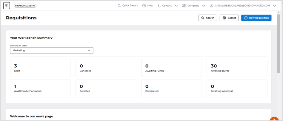
We’re excited to roll out a new look! Our updated interface is here to make your procurement portals journey smoother and more visually appealing. This also aligns with the changes we have made to Financials.
Click the link below to see an overview!
Financials - Procurement Portal
To view training materials access this link below.
https://advancedfinancials.helpdocs.io/category/2nuk0gvk93-procurement-portal
https://advancedfinancials.helpdocs.io/category/2nuk0gvk93-procurement-portal
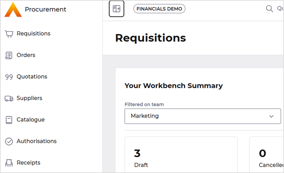
A new Dark and Light mode is available for each user, accessed from My Account then select the Application Settings.

There is a more responsive display by allowing the user to hide and expand the menu by selecting an icon.

Document Creation Enhancements
If a user selects the New Requisition or New Order button a new Select button is displayed to select you document type.

Currently you would just select a link.

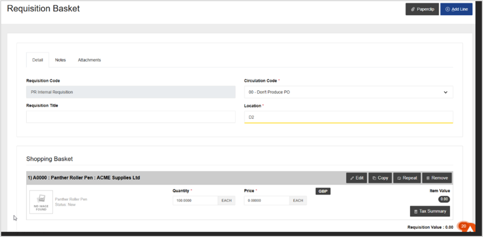
When creating a requisition or order, the Lines are now are on a different format this will allow a user to view more lines before having to use the scroll bar.
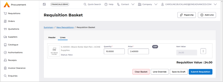
Current version shows the header and lines as a combined screen.
Navigation and Enquiry Enhancements
When accessing the workbenches and then selecting a tile a new breadcrumb trail is show that allows a user to select each document status with ease, this saves the user going back to the workbench to select another document status tile.
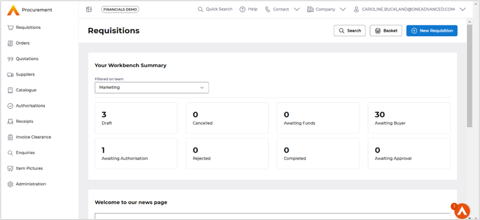
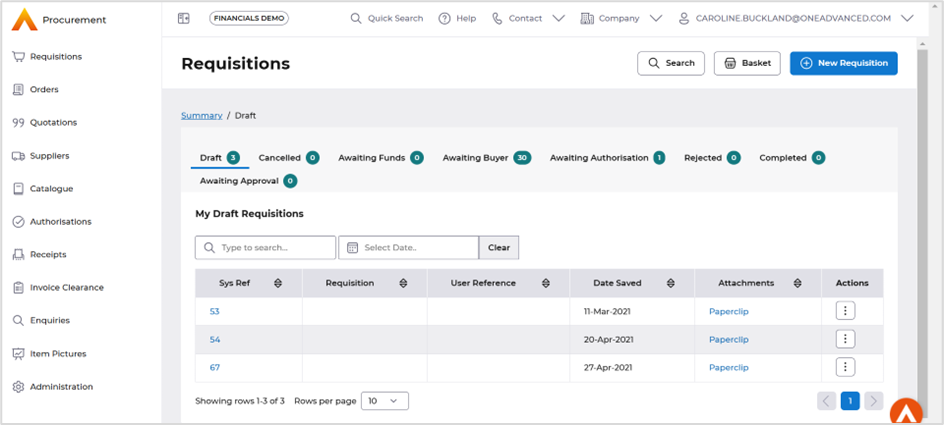
Current version you need to access the Go Back button.

Action buttons are available from any list or enquiry screen, they have been changed from a drop-down menu are now all options are accessed from the icon, this allows for more columns to be viewed on the screen.
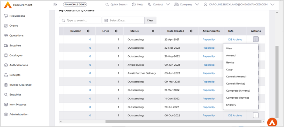
Current version.

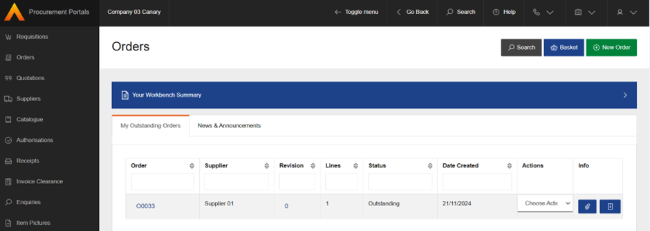
When accessing a list screen from a tile on the workbench, the Paperclip attachments and Document images are now show as a named linked.
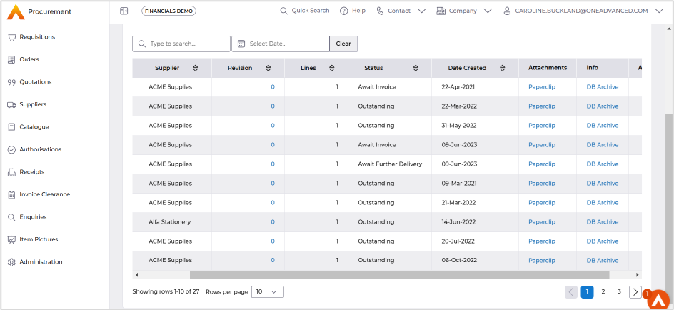
Current version shows as an icon.
There are new collapsible panels in the search forms, when accessing the enquiries menu the form can be opened and closed by selecting the down arrow icon.

This is ease of use to navigate from the search form to the results page.
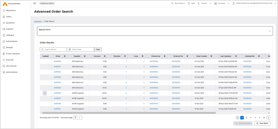
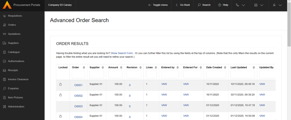
Currently they are on separate panels.
Then once the results are displayed the Show Search Form link is used to access the search selection.
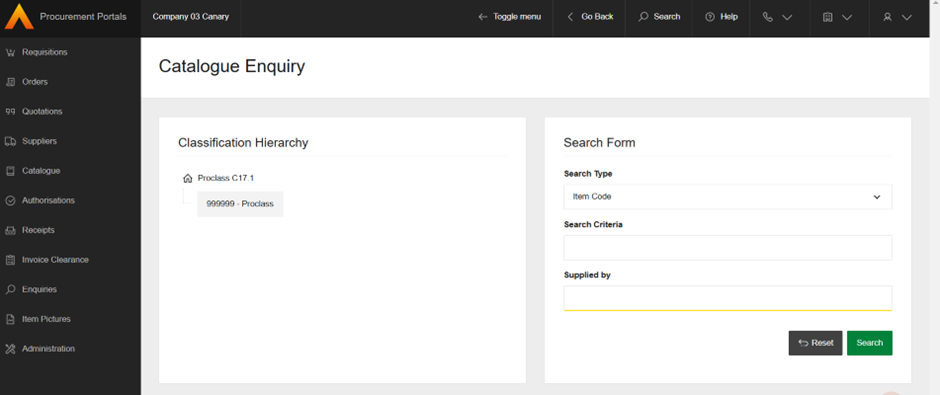
When using the catalogue search the classification hierarchy can be closed to allow full screen access on the search form.


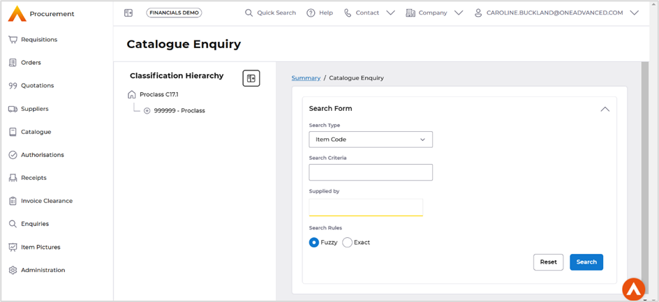
Current version shows both panels always displayed with no option to close the classification hierarchy.
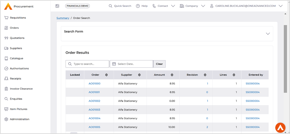
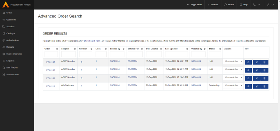
The list screens have improved Search options, the search field will filter all columns with an option to also filter on the dates field.
Current version each column has a search field.
When enquiring against documents the Actions button has now moved to top of the screen for ease of use.
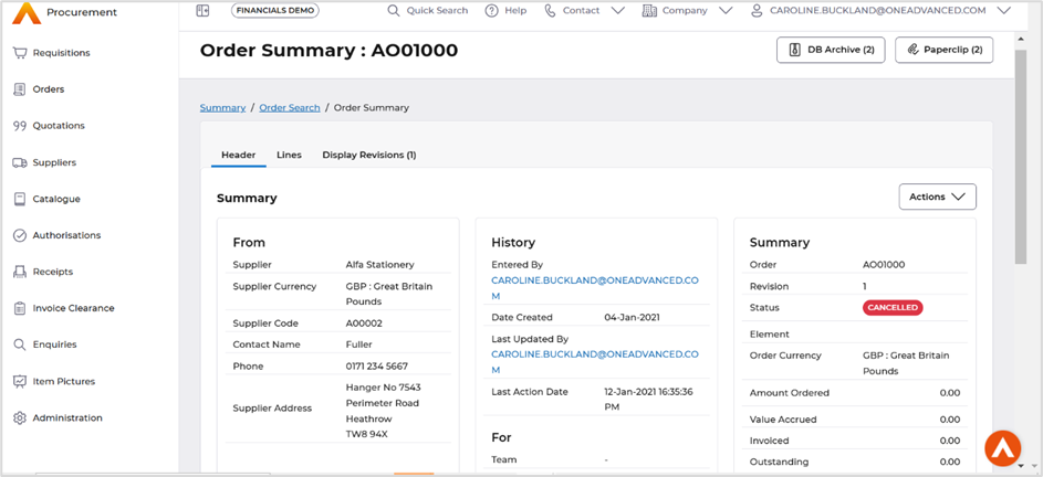
Current version the action button is placed in the middle of the screen.
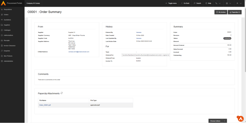
A new breadcrumb trail when using the Enquiries, this allows a user to go back to the search fields or the initial tile selection.

Current version the Go Back was used for this.
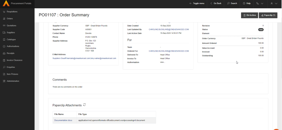
If a document has an attachment new download buttons are available, the on-screen view of these documents are available as buttons at the top right of the screen.
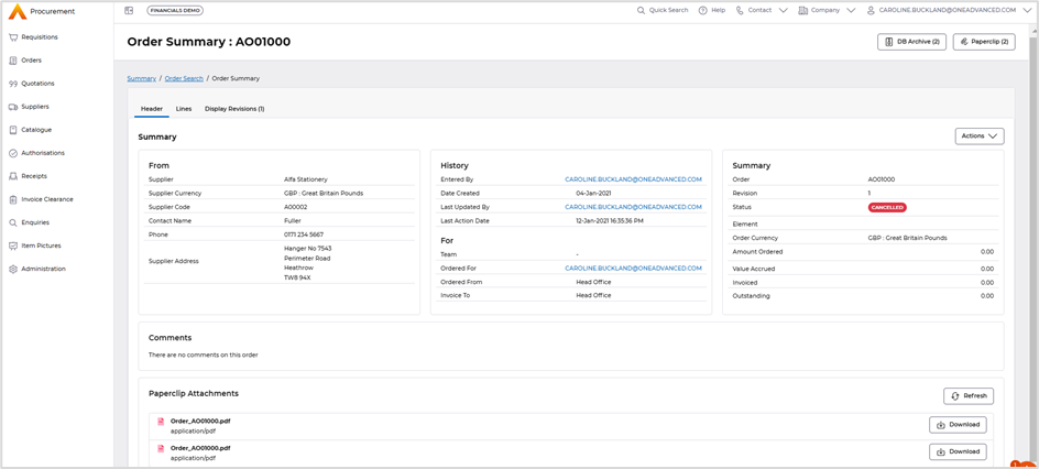
Download on the current version was only available after opening the attachment.

Authorisation Enhancements
When using the Proxy Structure Authorisation more of the screen is now available when searching for a user, the panel then can be collapsed to gain full view of the authorisation workbench

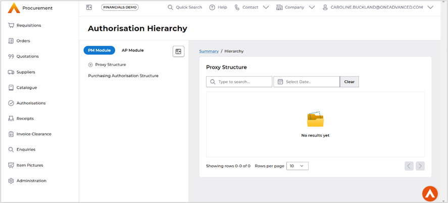
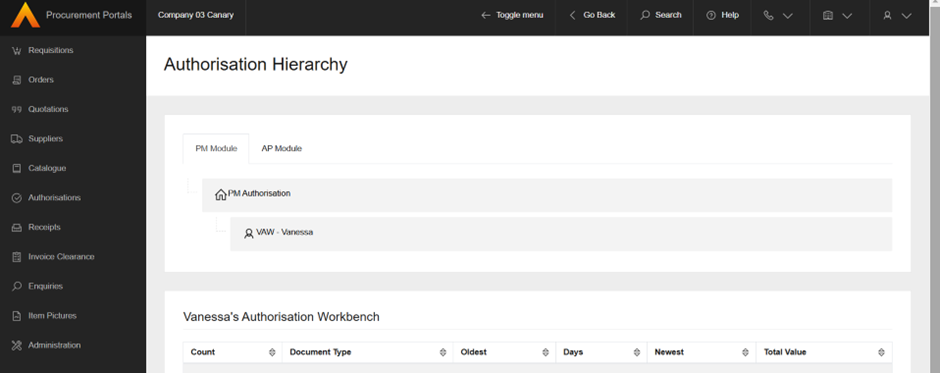
Current workbench the documents awaiting authorisation are displayed below the Proxy Structure.


Current view they the documents were listed underneath.
Receipting Enhancements
When accessing the Receipts screen a new breadcrumb trail is available for easier access to the other tiles.
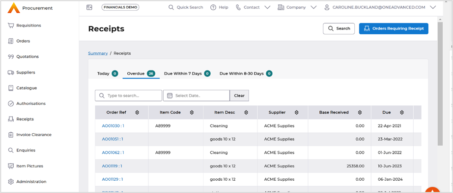
Current version the user would need to access the Go Back button.

Administrator Enhancements
The Administration options are now displayed as a panel to the left-hand side of the screen, this allows easier access to other options.
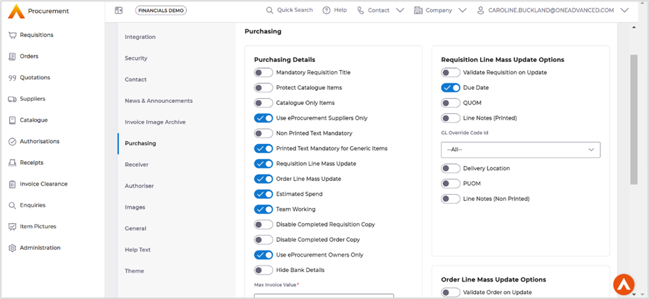
Current version the user would have to use the Go Back action to select a new tile.
